Smirking Owl
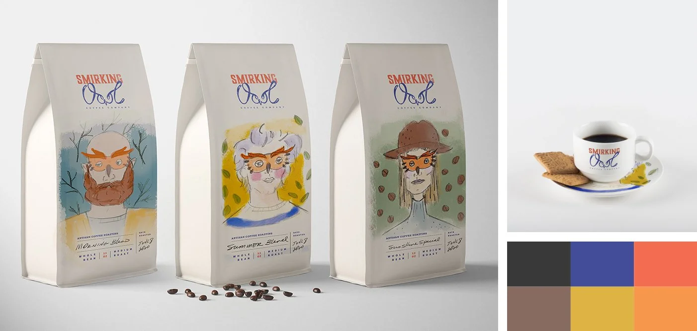
Project: Here’s an example of how a brand concept can take contrasting paths in the exploration process, in this case to strike appeal with a younger demographic. For one concept, explorations lead to quirky, masked portraits to capture the personalities of the roasts in a Fine Arts aesthetic. The base logo merged letterpress and a painterly script that echoes the owl masks.
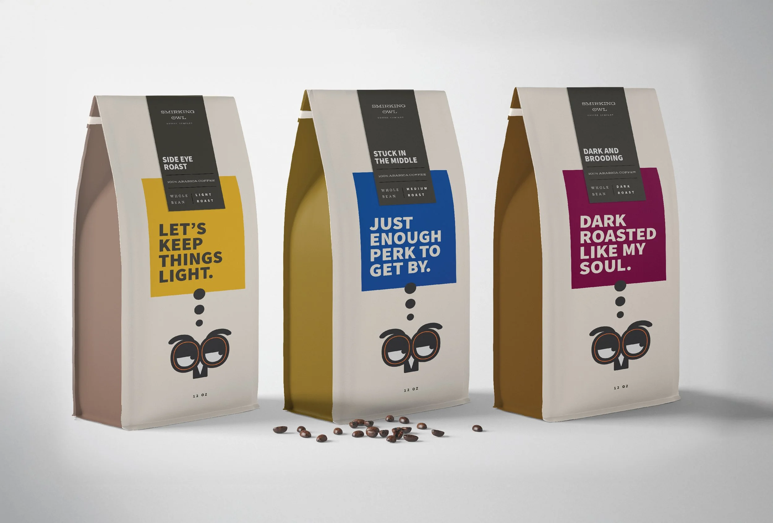
The second concept took a clean and modern approach that leaned on engaging copy and graphic-forward design to accentuate the attitudes of both the brand and individual roasts. This system is built around the base logo, a cartoon-style illustration of an owl face.


